Speech Visualization
Kevin Slattery
Naomi Yarin
Geoff Balasi
2012
Motivation
Our motivation was to create speech artwork that is not only visually pleasing and meaningful since it commemorates a favorite scene from a specific movie, but also provides important information about the speech such as the rate of speech, amplitude and energy patterns, as well as pitch analysis. In the future, it can be used to create portraits of ourselves through our important speeches, monologues, and conversations.
Amplitude
We started by creating paint splatter patterns according to the volume of the sound bit. We did this by getting the current level of the audio buffer which corresponds to the amplitude of the sound. We then took the amplitude of the current buffer and drew the splatter size accordingly.
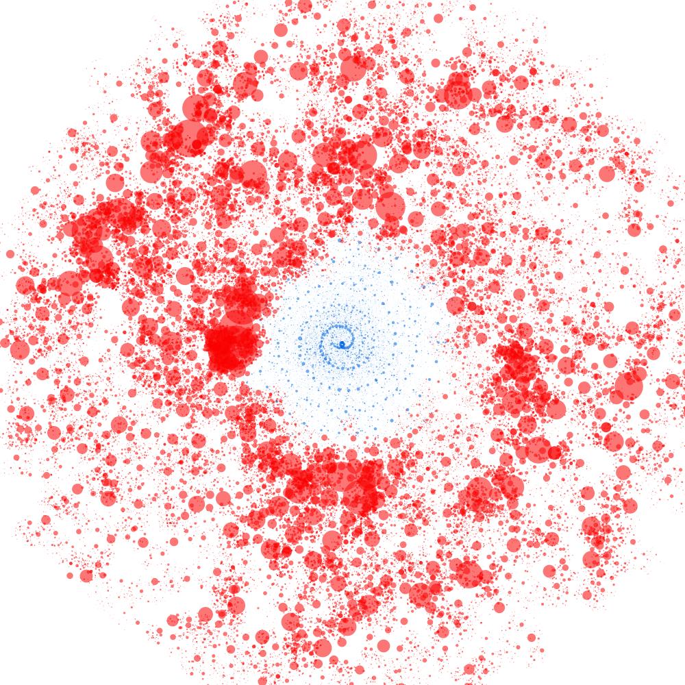
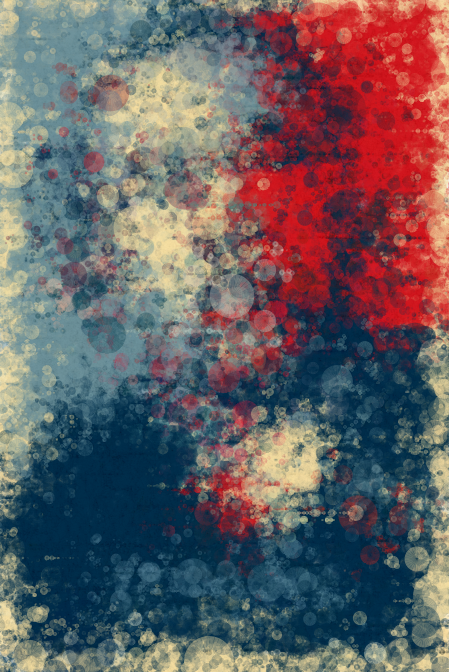
A visual representation of the famous shower scene from the 1960 Hitchcock film, Psycho . The spiral form of the visualization is a representation of the water as it goes down the drain. The loud stabbing noises change the blue spiral to a vibrant red color representing the blood that colors the water.
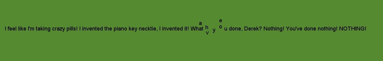
A visualization of a humorous quote from the 2001 comedy, Zoolander .
We visualized classic scenes from the movies 300 and A Few Good Men using amplitude analysis. The alternating colors represent the different characters speaking.
300
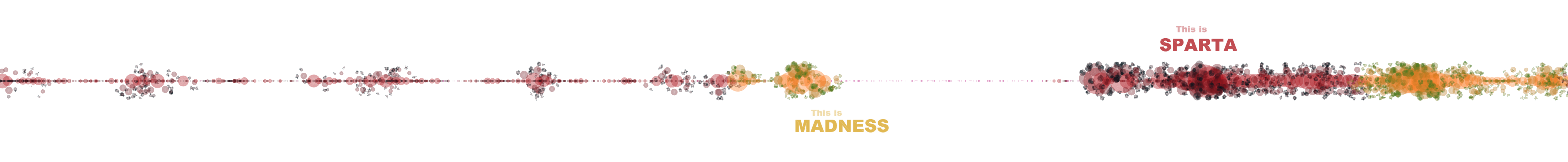
A Few Good Men

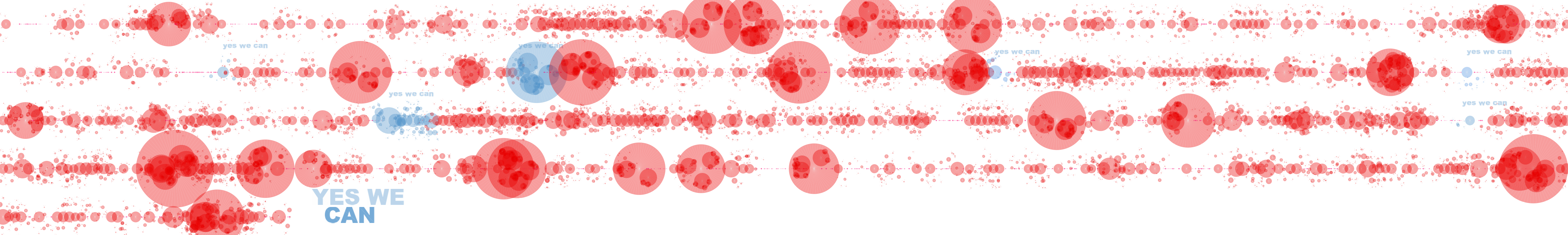
We did the same analysis for a clip from Obama's famous Yes We Can speech from his 2008 presidential campaign. In this case, the colors were taken from his campaign poster and are used to highlight any time he mentions the phrase "yes we can".

For a more artistic visualization, we decided to recreate Obama's campaign poster by randomly filling out the picture with the paint splatter generated by the amplitude of the current position in the speech. While we lose information such as speech/amplitude patterns, we thought the abstract portrait creation could be fun when trying to initially guess how the portrait will turn out. It also allows you to see big spikes in volume by noticing when the portrait changes drastically.
Frequency
We used the FFT tool in the minim library in order to transform our sound signals into the frequency domain. The resulting frequency spectrum represents bands centered on particular frequencies. We then used that spectrum to get a fairly simple (while not great or very reliable) pitch detector by analyzing the peak frequencies.
We decided it would be interesting to visualize Obama's speech according to frequency/pitch, since many times politicians will increase their pitch when speaking passionately. While the color representation stayed the same, the splatter size now corresponds to the frequency, meaning that larger splatters represent a higher pitch and smaller splatters or paint drips represent lower pitch. It is interesting to compare this visualization to the amplitude visualization of the same speech.
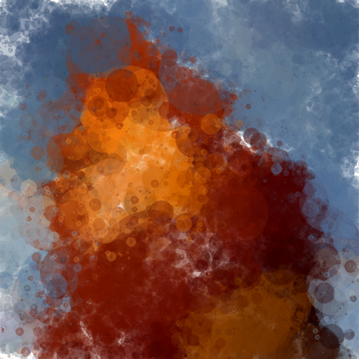
We wanted to continue with the abstract random portrait creation, so we decided to generate one for Mufasa from The Lion King using the same frequency analysis. While it is harder to detect patterns, it is easy to distinguish between Mufasa and Simba's pitch since you can see how there is much more activity and change in the portrait when Simba is talking, since his voice has a much higher pitch, so the splatter is much larger and more noticeable than when Mufasa speaks due to his low voice.
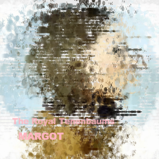
Energy
We used the Minim library frequency energy mode in order to track the frequency spectrum generated by the FFT and analyze it by dividing it into average frequency bands and then tracking each band individually for any rhythmic onsets that can be seen as energy.
We used this analysis method to create an abstract splatter portrait of Margot, a character from the movie The Royal Tenenbaums using the prologue from the movie. Instead of generating it randomly like we have done for the previous portraits, we generated it row by row, which shows any frequency energy patterns or any spikes in energy more clearly.